728x90
D3란?
D3.js는 웹브라우저 상에서 동적이고 인터렉티브한 정보시각화를 구현하기 위한 자바스크립트 라이브러리이다. D3.js는 프로토비즈의 라이브러리로 정보시각화 라이브러리이며, SVG와 HTML5, CSS 등 웹표준에 기반해 구현되어 있다.
D3 Gallery 링크 : https://www.d3-graph-gallery.com/
The D3 Graph Gallery – Simple charts made in d3.js
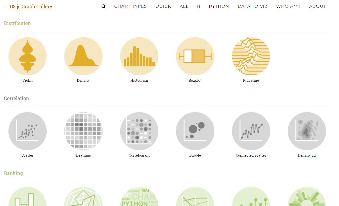
The D3 graph gallery displays hundreds of charts made with D3.js, always providing the reproducible code.
www.d3-graph-gallery.com
d3 Gallery에 가면 다양한 차트 샘플을 제공해준다.
이제 실습을 해볼텐데, 저의 실습환경은 운영체제는 Window 10, 서버는 Django입니다.
데이터는 python library중 seaborn에 내장된 tips 데이터를 이용하겠습니다.

웹에서 Ajax 방식으로 데이터를 불러오기위해 미리 데이터를 보내기 위해 파이썬 함수를 정의하였습니다.
from django.shortcuts import render
from django.shortcuts import render_to_response
from django.shortcuts import redirect
from django.http import HttpResponse
import seaborn as sns
import json

def get_tip_data(request):
    print("IN get_tip_data")
    sns.set()
    tips = sns.load_dataset("tips")
    tips_list=[]

    for i in range(0,len(tips)):
        tips_dict={"total_bill":str(tips.iloc[i]["total_bill"]),"tip":str(tips.iloc[i]["tip"]),"sex":tips.iloc[i]["sex"],
        "smoker":tips.iloc[i]["smoker"],"day":tips.iloc[i]["day"], "time":tips.iloc[i]["time"],"size":str(tips.iloc[i]["size"])}
        tips_list.append(tips_dict)

    json_stuff = {"tips_list":tips_list}

    if request.is_ajax():
        print("IN is_ajax")
        return HttpResponse(json.dumps(json_stuff), "application/json")
d3는 javascript에서 동작하기 때문에 javascript 코드를 작성하였다.
 <script type="text/javascript">

    window.onload = function() {
        $.ajax({
          url: 'get_tip_data',
        }).done(function(msg) {
            var data=[]

            for (var i=0; i<msg["tips_list"].length;i++){
                data.push(Number(msg["tips_list"][i]["total_bill"]))
            }

            //=======================================================//
            // 첫번째 그래프(boxplot - 총비용)
            var margin = {top: 10, right: 30, bottom: 30, left: 40},
            width = 400 - margin.left - margin.right,
            height = 400 - margin.top - margin.bottom;

            // append the svg object to the body of the page
            var svg = d3.select("#my_dataviz")
                .append("svg")
                .attr("width", width + margin.left + margin.right)
                .attr("height", height + margin.top + margin.bottom)
                .append("g")
                .attr("transform",
                        "translate(" + margin.left + "," + margin.top + ")");

            // Compute summary statistics used for the box:
            var data_sorted = data.sort(d3.ascending)
            var q1 = d3.quantile(data_sorted, .25)
            var median = d3.quantile(data_sorted, .5)
            var q3 = d3.quantile(data_sorted, .75)
            var end = d3.quantile(data_sorted,.99)
            var interQuantileRange = q3 - q1
            var in_min = q1 - 1.5 * interQuantileRange
            var in_max = q3 + 1.5 * interQuantileRange

            var max = -1
            var min = 100
            for (var i=0; i<data.length;i++){
                if(data[i] >max && data[i] < in_max){
                    max = data[i]
                }
                if (data[i] < min && data[i] > in_min){
                    min = data[i];
                }
            }

            // Show the Y scale
            var y = d3.scaleLinear()
                .domain([0,end])
                .range([height, 0]);
                svg.call(d3.axisLeft(y))

            // Show the X Scale
            var x = d3.scaleBand()
                .range([ 0, width ])
                .domain(["total_bill"])
                .paddingInner(1)
                .paddingOuter(.5)
            svg.append("g")
                .attr("transform", "translate(0," + height + ")")
                .call(d3.axisBottom(x))

            // a few features for the box
            var center = 165
            var width = 100

            // Show the main vertical line
            svg
            .append("line")
            .attr("x1", center)
            .attr("x2", center)
            .attr("y1", y(min) )
            .attr("y2", y(max) )
            .attr("stroke", "black")

            // Show the box
            svg
            .append("rect")
            .attr("x", center - width/2)
            .attr("y", y(q3) )
            .attr("height", (y(q1)-y(q3)) )
            .attr("width", width )
            .attr("stroke", "black")
            .style("fill", "#69b3a2")

            // show median, min and max horizontal lines
            svg
            .selectAll("horizontal_lines")
            .data([min, median, max])
            .enter()
            .append("line")
            .attr("x1", center-width/2)
            .attr("x2", center+width/2)
            .attr("y1", function(d){ return(y(d))} )
            .attr("y2", function(d){ return(y(d))} )
            .attr("stroke", "black")
            //=======================================================//

            //2번쨰 그래프 (boxplot - 팁과 요일)

            // 그래프 나오는 크기 조절하는거
            var margin = {top: 10, right: 30, bottom: 30, left: 40},
                width = 600 - margin.left - margin.right,
                height = 400 - margin.top - margin.bottom;

            // append the svg object to the body of the page
            // svg는 이제 그래프 어디까지
            var svg = d3.select("#my_dataviz2")
            .append("svg")
                .attr("width", width + margin.left + margin.right)
                .attr("height", height + margin.top + margin.bottom)
            .append("g")
                .attr("transform",
                    "translate(" + margin.left + "," + margin.top + ")");


            // Read the data and compute summary statistics for each specie


            data = msg['tips_list']
            console.log(data)
            // Compute quartiles, median, inter quantile range min and max --> these info are then used to draw the box.
            var sumstat = d3.nest() // nest function allows to group the calculation per level of a factor
                .key(function(d) { return d.day;})
                .rollup(function(d) {
                    q1 = d3.quantile(d.map(function(g) { return g.tip;}).sort(d3.ascending),.25)
                    median = d3.quantile(d.map(function(g) { return g.tip;}).sort(d3.ascending),.5)
                    q3 = d3.quantile(d.map(function(g) { return g.tip;}).sort(d3.ascending),.75)
                    interQuantileRange = q3 - q1
                    min = q1 - 1.5 * interQuantileRange
                    max = q3 + 1.5 * interQuantileRange
                    return({q1: q1, median: median, q3: q3, interQuantileRange: interQuantileRange, min: min, max: max})
                })
                .entries(data)


            // Show the X scale
            var x = d3.scaleBand()
                .range([ 0, width ])
                .domain(["Thur", "Fri", "Sat","Sun"])
                .paddingInner(1)
                .paddingOuter(.5)
            svg.append("g")
                .attr("transform", "translate(0," + height + ")")
                .call(d3.axisBottom(x))


            // Show the Y scale
            var y = d3.scaleLinear()
                .domain([-3,15])
                .range([height, 0])

            svg.append("g").call(d3.axisLeft(y))

            // Show the main vertical line
            console.log(sumstat)
            svg
                .selectAll("vertical_line")
                .data(sumstat)
                .enter()
                .append("line")
                .attr("x1", function(d){return(x(d.key))})
                .attr("x2", function(d){return(x(d.key))})
                .attr("y1", function(d){return(y(d.value.min))})
                .attr("y2", function(d){return(y(d.value.max))})
                .attr("stroke", "black")


            // rectangle for the main box
            var boxWidth = 100
            svg
                .selectAll("boxes")
                .data(sumstat)
                .enter()
                .append("rect")
                    .attr("x", function(d){return(x(d.key)-boxWidth/2)})
                    .attr("y", function(d){return(y(d.value.q3))})
                    .attr("height", function(d){return(y(d.value.q1)-y(d.value.q3))})
                    .attr("width", boxWidth )
                    .attr("stroke", "black")
                    .style("fill", "#69b3a2")

            // Show the median
            svg
                .selectAll("medianLines")
                .data(sumstat)
                .enter()
                .append("line")
                .attr("x1", function(d){return(x(d.key)-boxWidth/2) })
                .attr("x2", function(d){return(x(d.key)+boxWidth/2) })
                .attr("y1", function(d){return(y(d.value.median))})
                .attr("y2", function(d){return(y(d.value.median))})
                .attr("stroke", "black")
                .style("width", 80)
            // Add individual points with jitter
            var jitterWidth = 50
            svg
                .selectAll("indPoints")
                .data(data)
                .enter()
                .append("circle")
                .attr("cx", function(d){return(x(d.day) - jitterWidth/2 + Math.random()*jitterWidth )})
                .attr("cy", function(d){return(y(d.tip))})
                .attr("r", 4)
                .style("fill", "#FFBB00")
                .attr("stroke", "black")

            //=======================================================//

            //3번쨰 그래프 (scatter plot - bill과 tip)
            var margin = {top: 10, right: 30, bottom: 30, left: 60},
                width = 460 - margin.left - margin.right,
                height = 400 - margin.top - margin.bottom;

            // append the svg object to the body of the page
            var svg = d3.select("#my_dataviz3")
            .append("svg")
                .attr("width", width + margin.left + margin.right)
                .attr("height", height + margin.top + margin.bottom)
            .append("g")
                .attr("transform",
                    "translate(" + margin.left + "," + margin.top + ")");

            data = msg['tips_list']

            // Add X axis
            var x = d3.scaleLinear()
                .domain([0, 60])
                .range([ 0, width ]);
            svg.append("g")
                .attr("transform", "translate(0," + height + ")")
                .call(d3.axisBottom(x));

            // Add Y axis
            var y = d3.scaleLinear()
                .domain([0, 15])
                .range([ height, 0]);
            svg.append("g")
                .call(d3.axisLeft(y));

            // Add dots
            svg.append('g')
                .selectAll("dot")
                .data(data)
                .enter()
                .append("circle")
                .attr("cx", function (d) { return x(d.total_bill); } )
                .attr("cy", function (d) { return y(d.tip); } )
                .attr("r", 3)
                .style("fill", "#86E57F")


        });
      };
    </script>
-실행결과-
#첫번째 그래프

#두번째 그래프

#세번째 그래프

728x90
'데이터 시각화' 카테고리의 다른 글
| c3.js를 이용한 데이터 시각화/Wanna Be 컴잘알 (0) | 2019.10.17 |
|---|
